
Warm neutrals, muted color, visible texture, and purposeful layers can make curtains feel considered without locking a room into one short-lived look. The strongest choice responds to the daylight, furniture, privacy needs, changing seasons, and daily routines already present in the room.
Curtain colors that are easy to live with
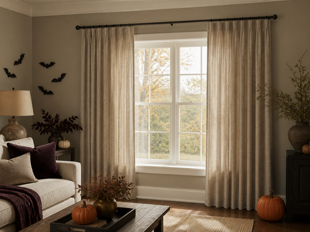
Warm beige, clay, olive, cocoa, and softened blue are easier to live with than a sharply themed palette. They add color without taking over the room, and they pair naturally with common North American finishes such as white paint, oak floors, walnut furniture, and black hardware.
The goal is not to match every surface. A curtain can sit one or two steps deeper than the wall color, repeat a tone from the rug, or introduce a quiet contrast beside the sofa.
| Room condition | Colors to try | What to avoid |
|---|---|---|
| North-facing or low-light room | Warm ivory, oat, sand, or muted clay | Gray-beige that turns cold in shadow |
| Bright south- or west-facing room | Olive, cocoa, dusty blue, or deeper neutral | Choosing from a screen without checking strong daylight |
| Open-plan living area | A tone already present in wood, upholstery, or a rug | A new accent color that appears nowhere else |
| Bedroom | Low-contrast neutrals or softened color | Selecting color before deciding privacy and lining |
Texture can carry the visual interest
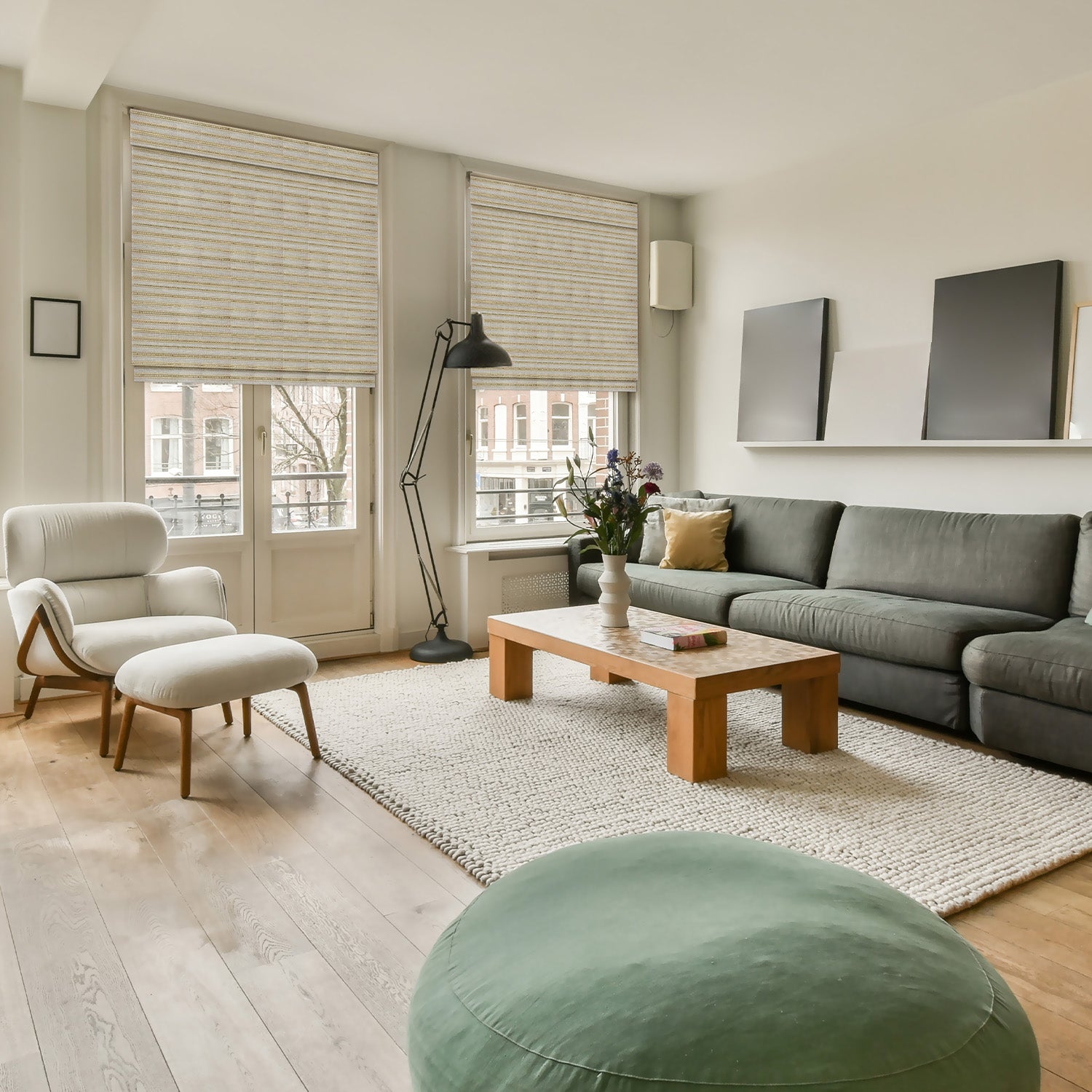
Slubbed, woven, washed, and softly structured fabrics can give a neutral panel enough depth without asking the rug, sofa, and artwork to compete with another print.
Look at texture from both near and far. A strong weave may read as calm across the room but compete with a patterned rug when viewed up close.
Fredesigner's linen curtain collection provides a useful place to compare current fabric families and room applications. Open the individual product page to confirm available colors, lining, headers, and custom fields.
Layering should solve a real problem
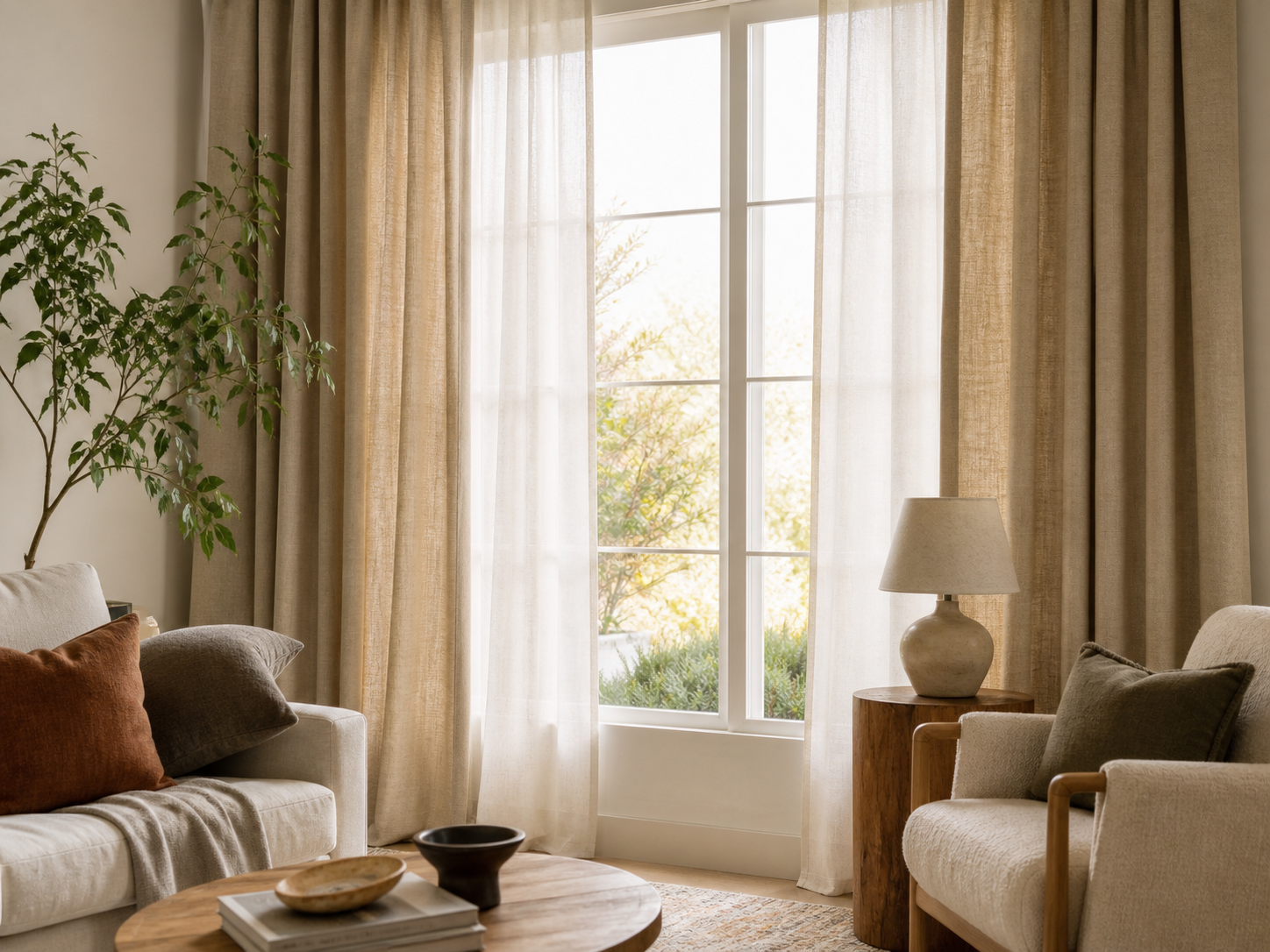
A sheer or light-filtering layer can soften daytime light, while a second curtain can add privacy, color, or stronger coverage. Layering makes sense when the room needs more than one lighting condition during the day.
It is not required for every window. A single well-fitted panel can be the cleaner choice when the room already has architectural detail, a strong view, or limited wall space.
Before planning two layers, confirm:
- How much privacy the room needs during the day and after dark.
- Where each layer will hang and how much wall space the panels need when open.
- Whether the rod or track can support the selected construction.
- Which layer will be opened most often.
- How lining and side coverage affect the final result.
Tailored proportions matter more than a trend label
Even a current fabric can look awkward when the rod is too narrow, the panels have too little visual fullness, or the hem stops at an unintended point. Plan the finished curtain area around the actual window, hardware, floor, baseboard, furniture, and panel stack.
Use Fredesigner's drapery measuring guide before entering a custom width or length. Follow the current guide and exact product form rather than copying measurements from another curtain.
A room-first way to use the trends
For a living room, start with daylight and the view. A textured neutral can frame the window quietly, while a muted blue or olive can connect the curtains to upholstery or art.
For a bedroom, decide nighttime privacy and desired darkness before color. The base fabric, liner, panel coverage, and possible edge gaps all affect the result.
For a dining room, consider how the fabric looks in daytime and under warm evening lighting. A richer neutral or controlled texture can add depth without making the room feel seasonal.
What makes a curtain choice age quickly?
The least useful choices are those made only for a trend photograph: an unsupported environmental claim, a color that works only in one lighting condition, or a decorative layer that blocks daily operation. Overly coordinated sets can also make a room feel rigid.
A better approach is to choose one main idea and keep the rest practical. Use texture with a quiet color, or use a stronger color with a simpler surface.
Put one idea to work
In a living room with an active rug, a quiet woven neutral may be enough. In a bedroom with simple bedding, muted olive or dusty blue can become the main color. A second layer earns its place only when it solves a different daylight or privacy condition.
Once the look is clear, settle the lining, header, hardware, finished width, and length. A curtain that fits the room and operates easily will outlast a look chosen only because it appeared in a dated trend roundup.