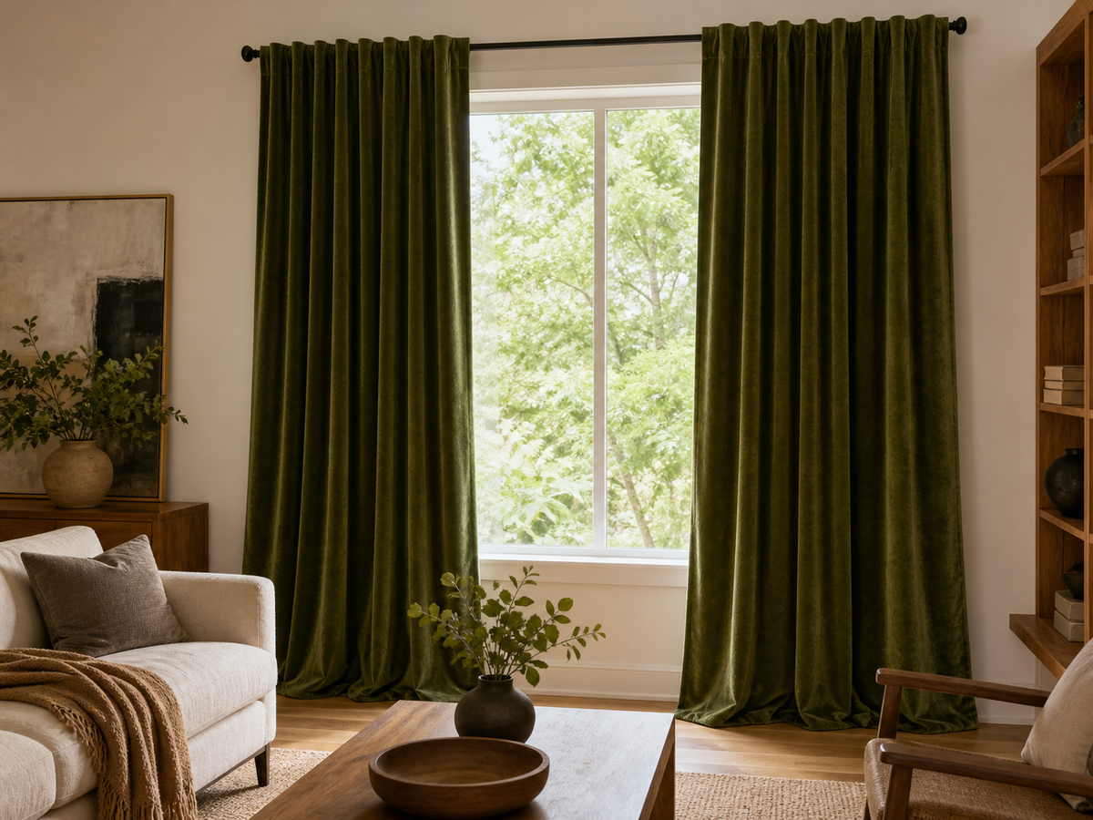

Solid velvet works best when a room needs visual depth, a fuller-looking drape, or one strong field of color. It is especially effective beside simple walls and restrained furniture. Velvet alone does not prove blackout, thermal, or sound performance, so choose those functions through the fabric, lining, coverage, and specifications shown on the product page.
Use velvet where light can reveal the pile
Velvet changes as light moves across its surface. The same color may appear deeper in shadow and lighter where the pile catches daylight. That variation is part of the look, but it makes screen color less reliable.
Check room-facing and close-up product images. If a sample-book option is available, view it vertically near the window because a fabric lying flat on a table may reflect light differently from a hanging panel.
Rooms with side light often show the surface most clearly. In a very dark room, a deep velvet can lose detail and read as one heavy block, especially when the walls and furniture are also dark.
Choose color by contrast, not by trend
Solid velvet already carries visual weight, so it rarely needs an elaborate pattern. Pick a color that relates to one fixed element in the room:
- Olive or muted green can connect with warm wood and earthy rugs.
- Rust or cocoa can add warmth beside cream walls and dark metal.
- Dusty blue can create contrast near oak, tan leather, or warm white paint.
- Charcoal or deep navy can frame a bright window in a restrained room.
- A pale neutral can keep the texture visible without introducing a strong accent.
These are styling ideas, not product availability claims. Review the colors on the product page.
Match the scale of the fabric to the window
A wide or tall window can support a richer surface because there is enough room for the folds to read. On a narrow window, dark velvet panels may cover a noticeable amount of wall when open.
Plan where the curtains will stack and how much glass you want exposed. The drapery measuring guide explains the measuring workflow. Keep any numeric allowance tied to the header and scenario described there.
Treat lining and header as separate decisions
The face fabric controls much of the appearance, while lining can affect privacy, light control, and body. The final result also depends on side coverage, center overlap, finished length, and edge gaps.
Review Fredesigner's liner and interlining guide, then check that the selected option is offered on the product you are considering.
Header choice changes how velvet folds. A tailored header can organize the weight into regular pleats, while a softer construction can look more relaxed. Use the header style guide to compare visible shape and hardware requirements.
Keep the rest of the room quieter
When velvet is the room's main texture, pair it with simpler surfaces. A low-pile rug, plain upholstery, or wood furniture lets the curtains hold attention without making the room feel crowded.
If the sofa, headboard, and curtains are all plush, vary their color value or scale. Repeating the same dark, soft surface across every large object can reduce separation.
Check care before committing to a large panel
Pile fabrics can show pressure, directional marks, dust, or handling differently from a flat weave. Follow the care instructions supplied with the selected product because washing, steaming, brushing, and ironing methods vary among velvet fabrics.
Browse the curtain collection, then review fabric composition, color, lining, header, dimensions, care, and stock on the product page. Velvet is a visual material first; any light-control or comfort performance still needs product-specific evidence.